GShade: The ultimate guide
First of all, I don’t consider myself a guru. There is always room for improvement, things to learn and areas to perfect. But everyone has to start somewhere, and it's easy to feel lost sifting through various sources of information, trying to find something practical to apply. I've tried to put all my knowledge into this article. It's not just about shaders; there's also a basic tutorial on the fundamentals of photography, aimed at enhancing your understanding of which sliders to adjust and why.
Let's start with the basics.
PATIENCE
You'll definitely need it. Many of my presets undergo extensive and tedious gameplay testing under various weather conditions and lighting. If your goal is to create something universal that works for indoor screenshots, outdoor scenes, winter, summer, rain and midday – make yourself some tea, add a shot of something and get ready to dive into the slider settings.
That said, there's nothing stopping you from having a "experiments" section and creating situational presets – they definitely have their place. My own folder is filled with a billion different works-in-progress, including presets for "dramatic midnight shots under a streetlamp" (which would look terrible under any other lighting).
Today, we're talking about gameplay-friendly presets.
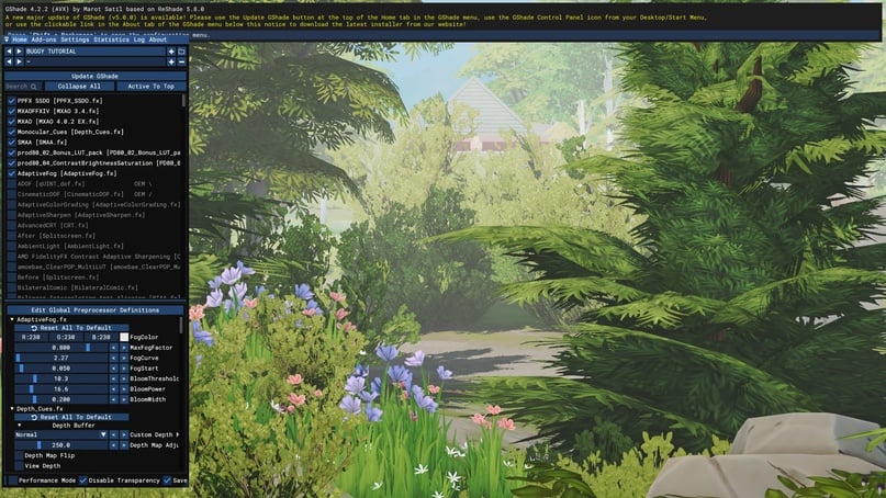
GSHADE SETUP
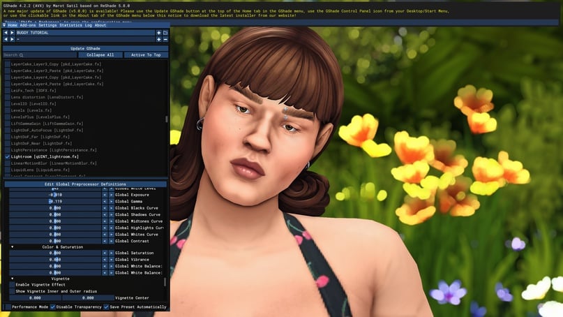
Let's create a convenient workspace. Open the control panel (shift + backspace) and go to the settings.
Here you can configure hotkeys, set the path to the screenshot folder and customize the appearance of the window.
Hotkeys (to set your own key, place the cursor in the window and press the desired key on the keyboard):
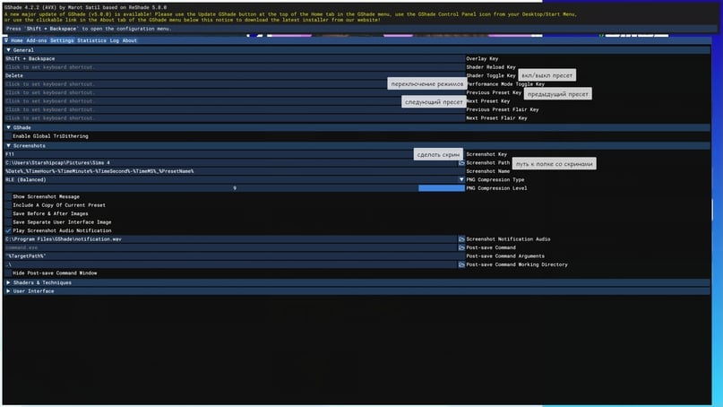
- Shader Toggle Key – This key turns all shaders off (and back on). I use it when taking screenshots of the interface, for example.
- Performance Mode Toggle Key – Switching to this mode will turn off all unused shaders, reducing the compilation time for the shaders currently in use, thereby improving performance. The difference is barely noticeable on powerful PCs, but for those with less powerful hardware, I recommend paying attention to this mode.
- Next/Previous Preset – Switch between presets without selecting from a list, just by clicking with the keyboard.
- Next, there's the Screenshot Key and the Screenshot Path.
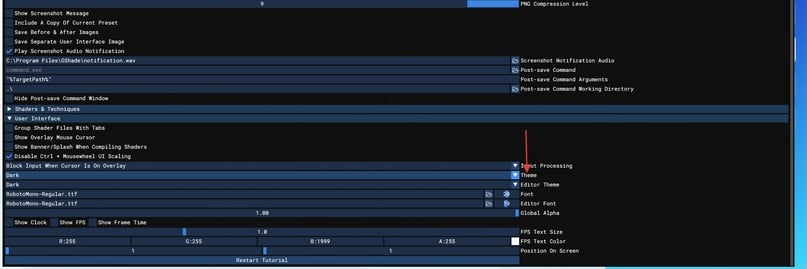
In addition to hotkeys, you can also set up a comfortable interface. Click on the last tab User Interface.
You can change the theme and font size to make it easier on your eyes – you'll be spending some time looking at the menu.
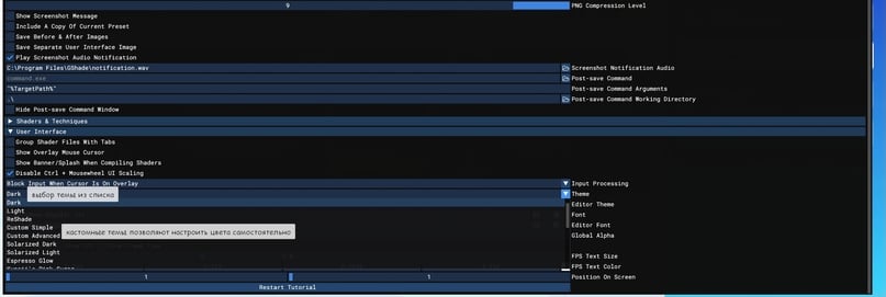
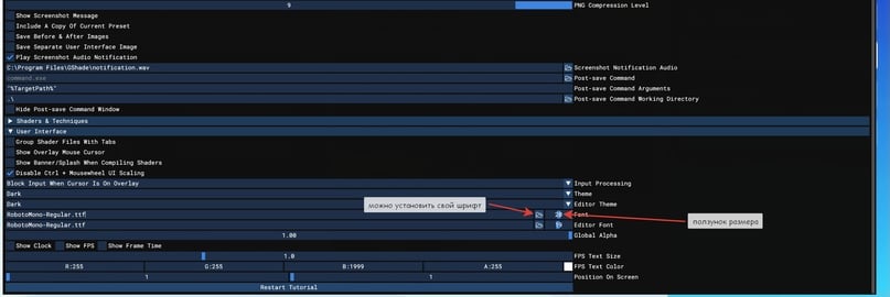
*open the list*
To finish the setup, let's open the in-game settings.
Turn off anti-aliasing and post-processing effects
This is important!
Now comes the math, because this is a critical issue. “But mine works just fine!” It doesn’t work or it doesn’t work as well as it should. The game’s anti-aliasing uses the same Z-buffering as blur shaders, shadows (like MXAO, and others). Z-buffering accounts for the distance of an image element. Is our game 3D? Absolutely. When the graphics card renders a pixel, its distance is calculated, and if pixels overlap, their depths are compared, and only one is drawn!
Enabled anti-aliasing will interfere with GShade’s ability to properly render its shaders, resulting in a mess.
Post-processing effects are another potential source of problems. If you enable a preset and your shaders turn off when you change the camera position, shadows flicker or other strange issues occur, disable post-processing.
PREPARING THE "CANVAS"
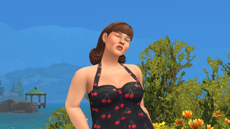
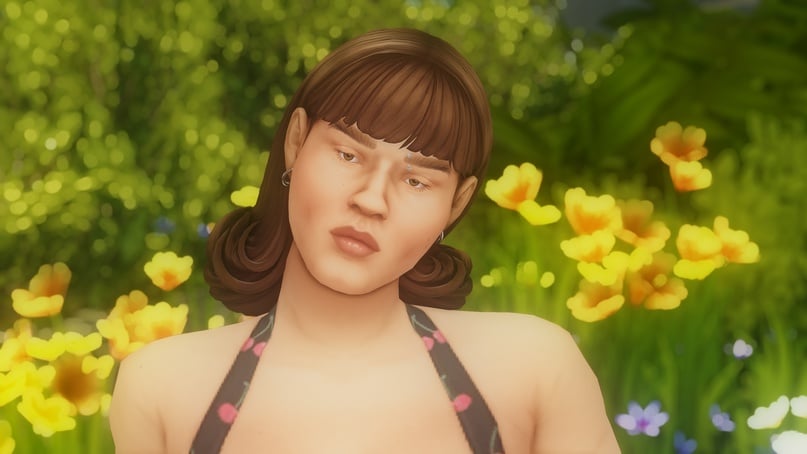
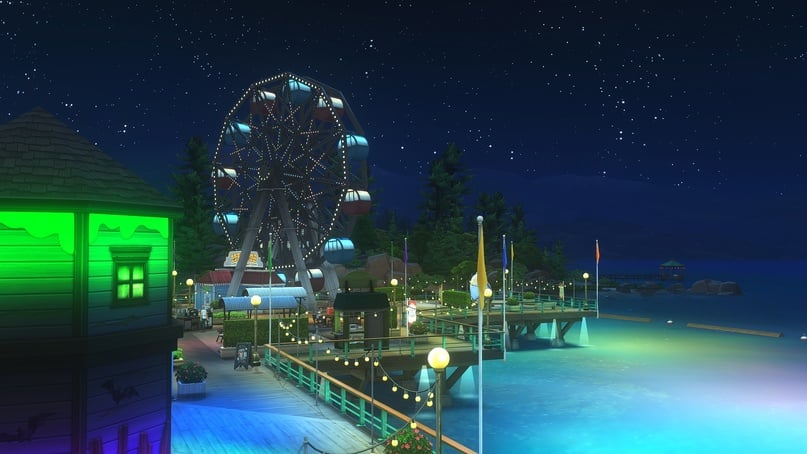
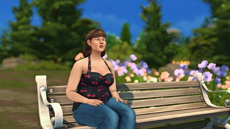
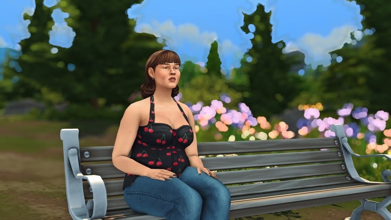
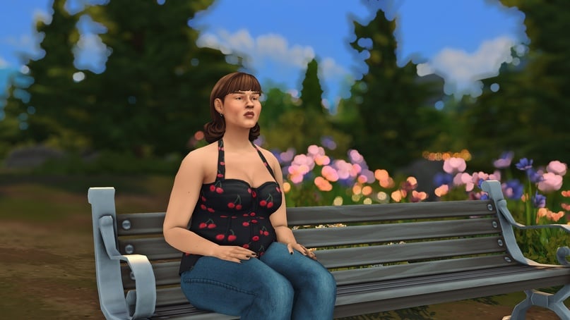
Now we need to choose a test character and create a working canvas.
My recommendations:
- Always set up the preset with a character in the frame. Since sims are our primary subject for shooting, the preset’s color reproduction and effects should look appropriate on them (unless you're specifically making a landscape preset).
You might also like...
- Set up the preset outdoors, under natural lighting, on a sunny day around 10-11 AM (in-game time, of course). Noon can be very bright, and trying to tone down this brightness might result in not seeing anything clearly at other times of the day. This can be adjusted during the correction stage, or you can simply sacrifice these three hours. In real-life photography, noon is also a difficult time due to the abundance of harsh, bright light and aggressive shadows.
- If you’re not very experienced with color correction, it’s best to adjust the sliders during a season without snow. Greenery in the towns is an important part of the environment, and when everything is covered in snow, you risk setting an incorrect balance that will ruin all the green elements. The same goes for yellow leaves. You can, of course, create an atmospheric autumn preset that highlights the right colors, but its versatility will be questionable.
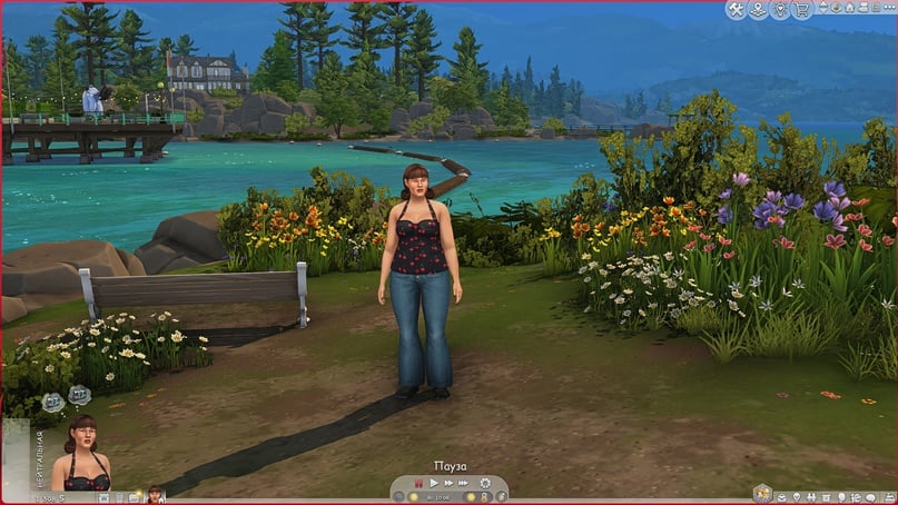
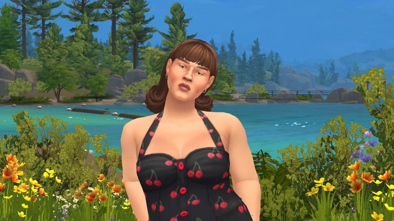
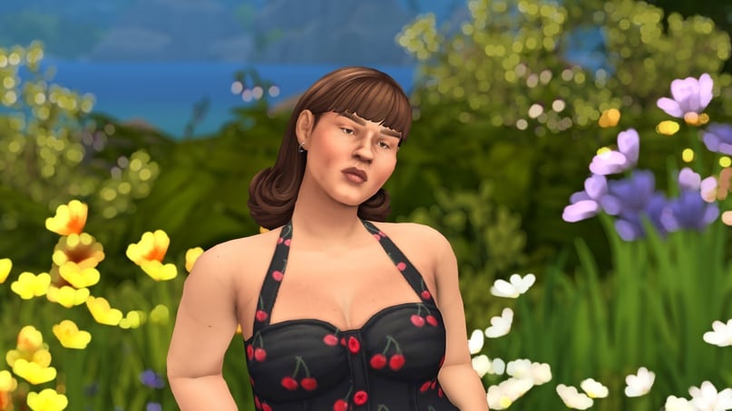
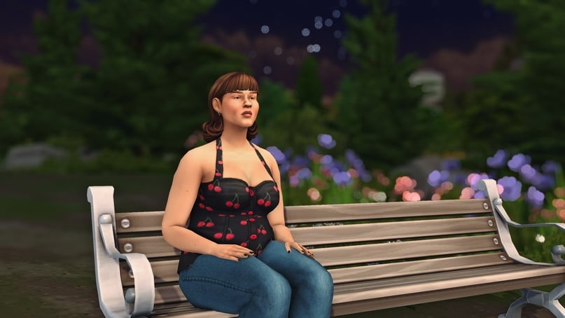
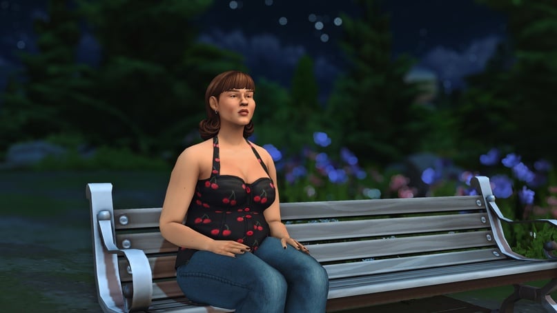
*example setup: 10 AM, sunny, natural light, character and a variety of in-game colors around*
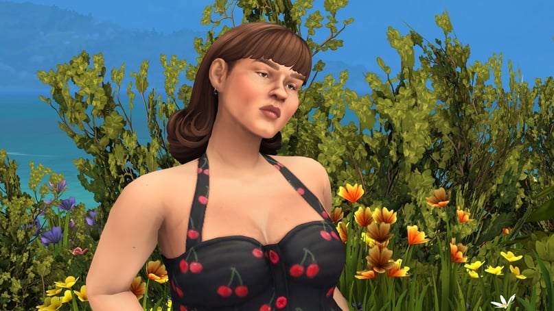
Next, either choose a neutral facial expression or pose the character in a way that’s not annoying and makes it pleasant to work with the image. It’s best to use a waist-up angle so you can see the face, surroundings, and optimally adjust the shadows.
ANTI-ALIASING, SHADOWS, BLUR
These are the three pillars upon which any preset stands. First and foremost, we need to restore smoothness to the edges.
Open the GShade panel, click on the plus sign in the top right corner, enter the name of our preset and press Enter.
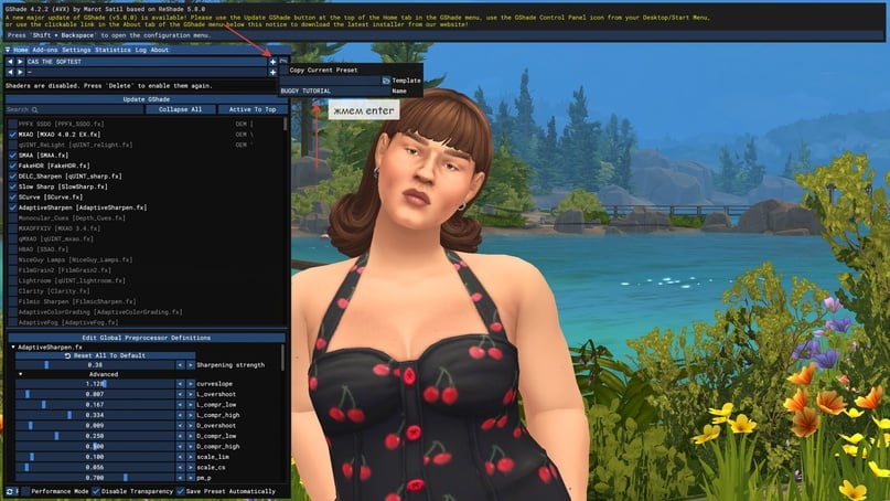
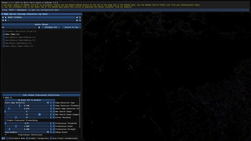
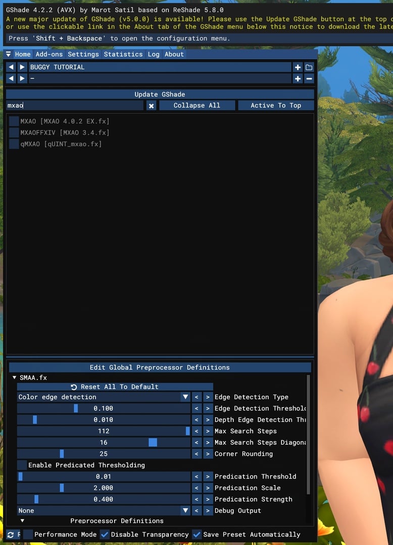
Look for SMAA in the shader list.
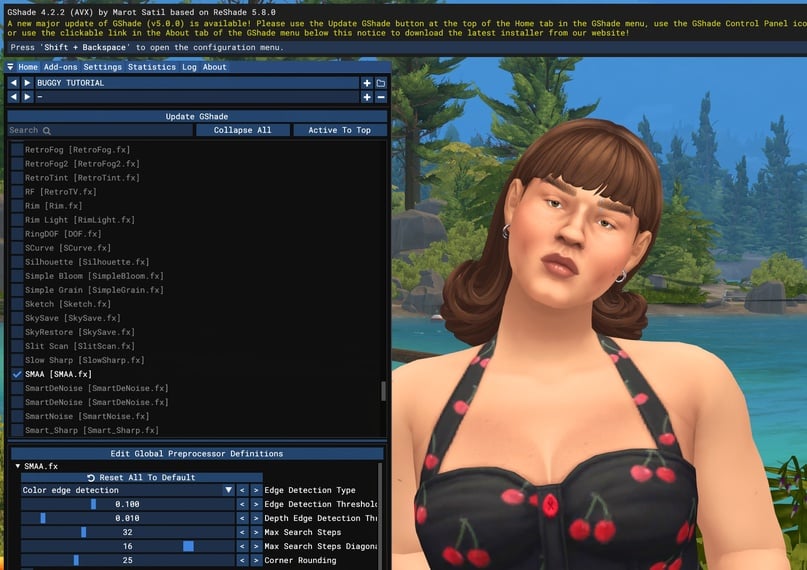
Next, you need to set the number of "steps" (max search steps), and it should be no less than a hundred. This determines the radius within which the shader will search for edges to smooth out.
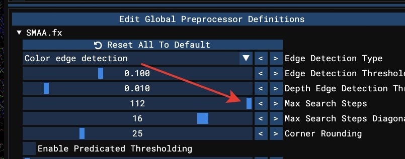
A visual demonstration of how the number of steps affects the result.

*number of steps – zero, small radius, the image will be jagged*
Why do we choose SMAA? Because it offers the ideal balance of cost and quality. Thanks to the extra steps I mentioned earlier, this type of anti-aliasing works exceptionally well in Sims, preserving details without blurring everything indiscriminately, all while being gentle on hardware.
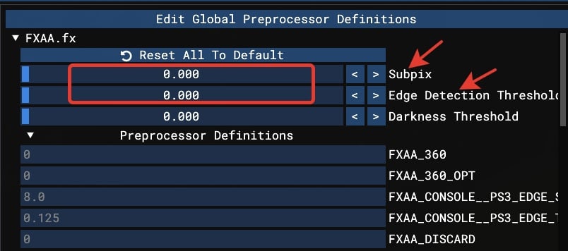
I've noticed that many presets include both SMAA and FXAA, another type of anti-aliasing. There's no need to duplicate anti-aliasing methods. I recommend sticking with SMAA because FXAA performs worse: it simply blurs the edges that should be softened.
Additionally, FXAA affects text in the game.
If you still adhere to FXAA for some religious reasons, please pay attention to the subpix and edge detection settings. Edge detection is responsible for finding edges based on contrast, while the subpixel method uses subpixels of the matrix accordingly. Setting all values to zero will still give you smoothing, but without that monstrous blur (Sims are already quite blurry).
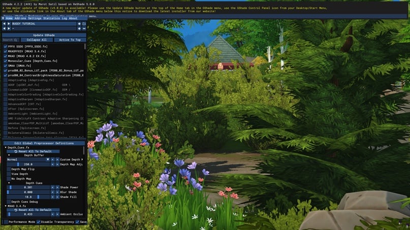
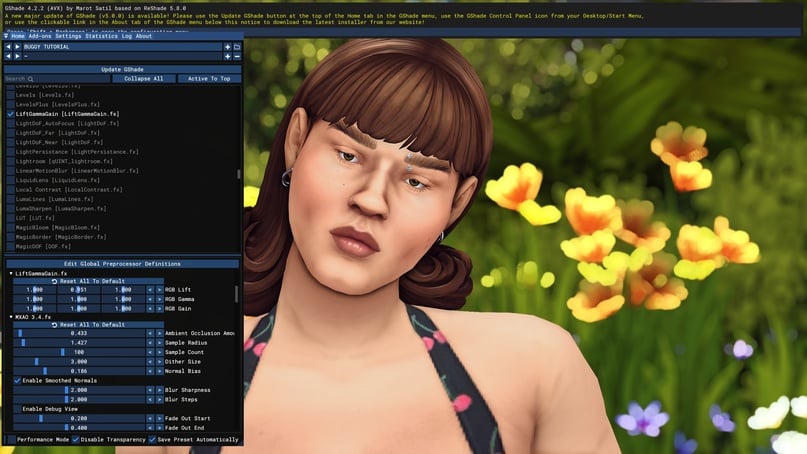
We've covered anti-aliasing, now let's move on to shadows. Let's start with MXAO.
MXAO is the most popular and well-known shader, needing no introduction and offering plenty of customization options. Some prefer shadows to be brighter and more pronounced, while others prefer them subtle.
MXAO has three components:
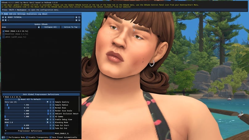
I often use all three of them because they have different rendering methods and combining them allows for achieving various effects. Their settings are the same, so I'll talk about the customizable parameters and leave room for improvisation. Choose your shader and the first thing to pay attention to is the sample quality.
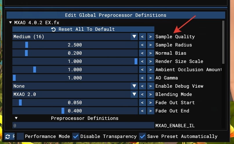
The higher the value, the fewer pixels we will see in the displayed shadow.

*1 of 2: low quality results in pixelation and jagged edges in the shadows.*
I recommend setting it to ultra. It's not necessary to play with shadows enabled – it's a significant load on your graphics card, so spare your computer. But taking screenshots? Always welcome.
Next are the three main settings: sample radius, normal bias, ambient occlusion amount, and this is where personal preference comes into play.
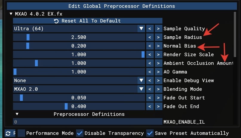
- Sample radius – simply put, this is the radius of the spread of our shadow: the higher the value, the darker and larger the shadow.
- Normal bias – same concept, but opposite: the higher the value, the less shadow. However, a higher value also means a more realistic shadow. Sounds good, right? The issue is that realism in Sims is somewhat conditional, and graphics are no exception. The shadow will be realistic, but you might not notice it (especially with sims, which are as flat as pancakes and don't reflect light and shadow from the world).
- Ambient occlusion – the intensity of the shadow.
Examples:

*1 of 3: without shadows*
Choose what you prefer and mix the sliders accordingly.
Add additional MXAO shaders to add more volume.
*1 of 2 with just one MXAO shader*
Tips:
- Remember to adjust shadow quality in each shader.
- In the MXAO 3.4 shader, check "Enable Smooth Normals" for smoother rendering.
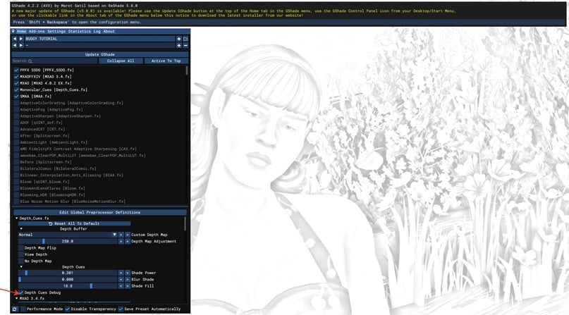
- You can switch to debug mode; for some people, rendering in this mode may be more illustrative.
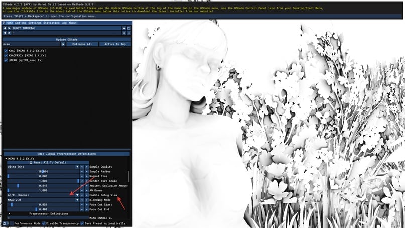
*debug mode*
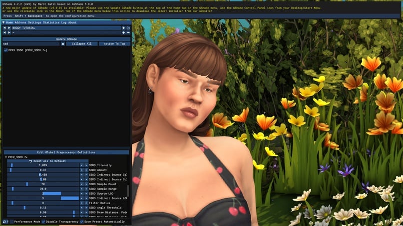
Let's continue our journey through the realm of shadows. SSDO shader.
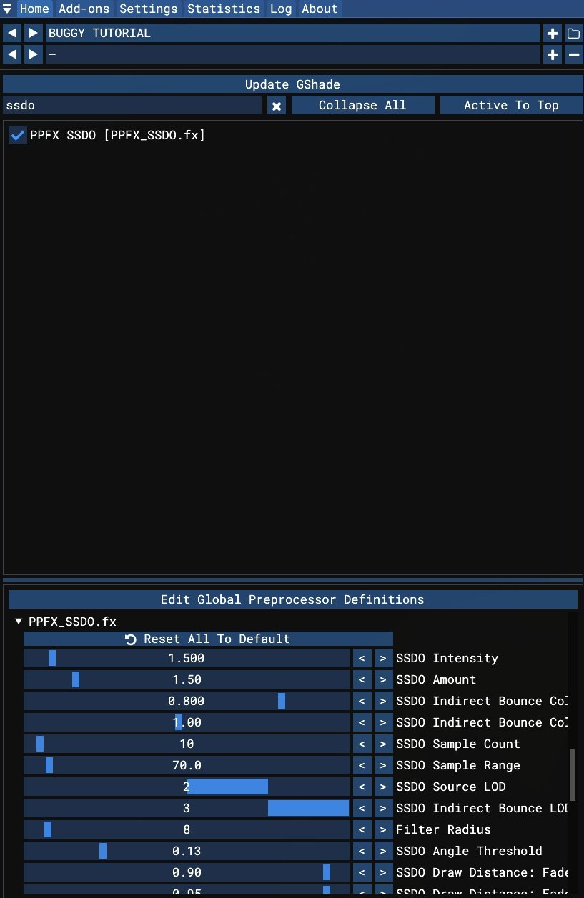
This is a very cool shader that helps enhance volume where MXAO might fall short, especially useful for character faces.
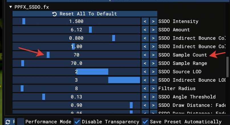
Let's start again with shadow quality, specifically the parameter SSDO sample count.
Don't be alarmed: I've set the brightness high so you can see the pixels :)
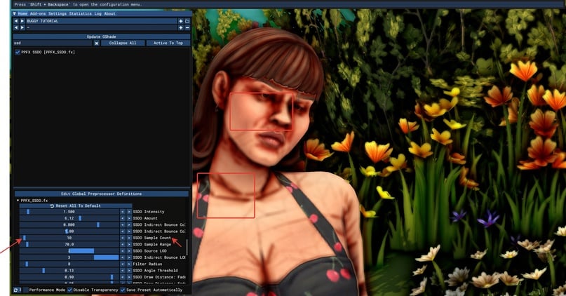
By default, the value is set to 10. For this shader, setting the parameter around 70 should be sufficient to smooth out the rendering.
Now let's make everything look nice! Let's adjust the color and saturation of the shadows.
For the color, adjust the "SSDO indirect bounce color" slider. Feel free to lower it to the middle or even lower to remove that intense reddish tone.
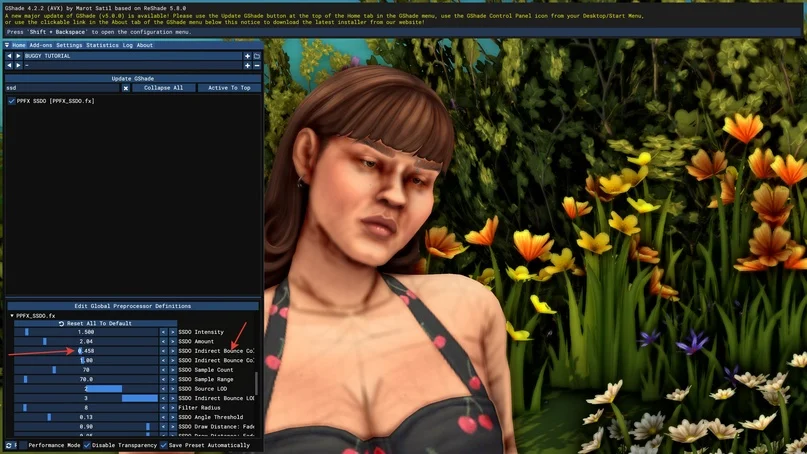
Next, let's fine-tune the intensity and amount – this shader is more finicky than MXAO, so sometimes you have to adjust it for different portraits, but the extra volume is worth it.
Adjust it according to the current position of your sim. Here's how I have it set up:
Difference:
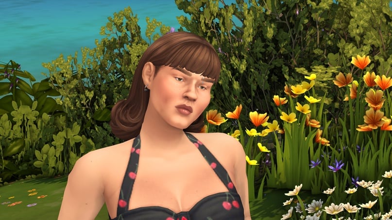
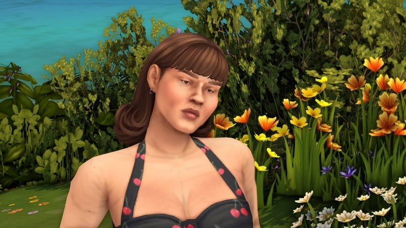
*1 of 2 with MXAO*
Again, I've made it brighter for clarity, so you may notice overly bright rendering on the shoulders and chest – you can make everything more delicate.
For example:
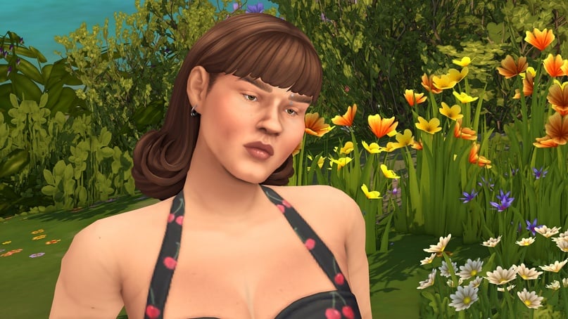
And our final helper in creating volume is Monocular Cues.
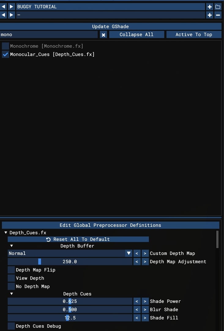
This shader looks good right from the first activation.
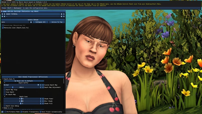
You can make it even better. If you look closely (this will be noticeable in the game itself, especially on a large monitor), the shadow blurs slightly.
I'm not a fan of unnecessary blur in a game where everything is already smooth. If you feel the same way, inside the shader there's a setting called "Blur Shade" that controls this soapy element. Turn it off.
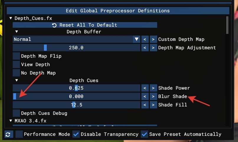
Shade power and shade fill control the strength of the shadow and its intensity when the radius doesn't change much, but the rendering becomes more saturated. Let's experiment!
There's also a debug mode available here, so feel free to use it confidently.
I reduced the shadow power, but on the contrary, I increased the shade fill.

We've finished with shadows, now an important point is their position in the shader list. They should always be at the very top; otherwise, they might be abused by blurring (remember the buffering I mentioned earlier? We need to give shadows priority).
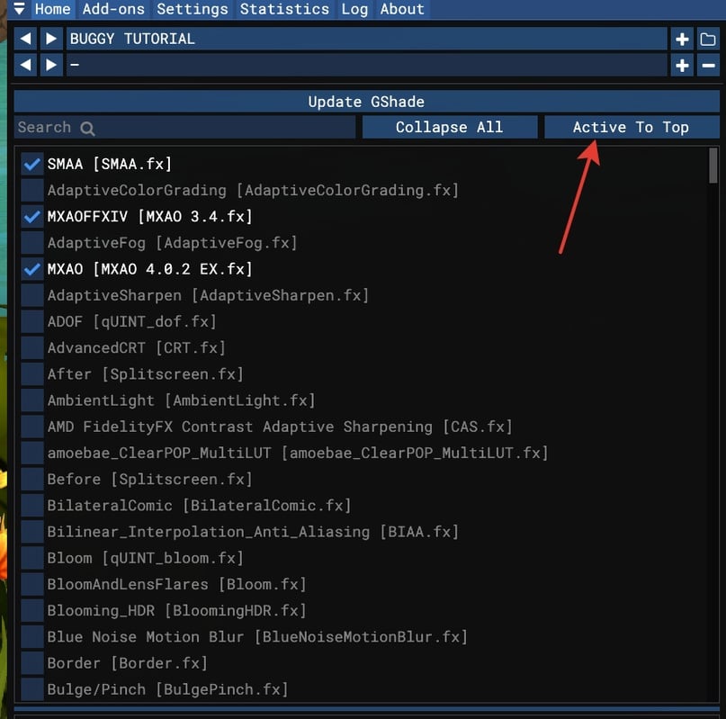
*1 of 3: move to the top of the list and click "Active to Top". This will bring all shaders to the top.*
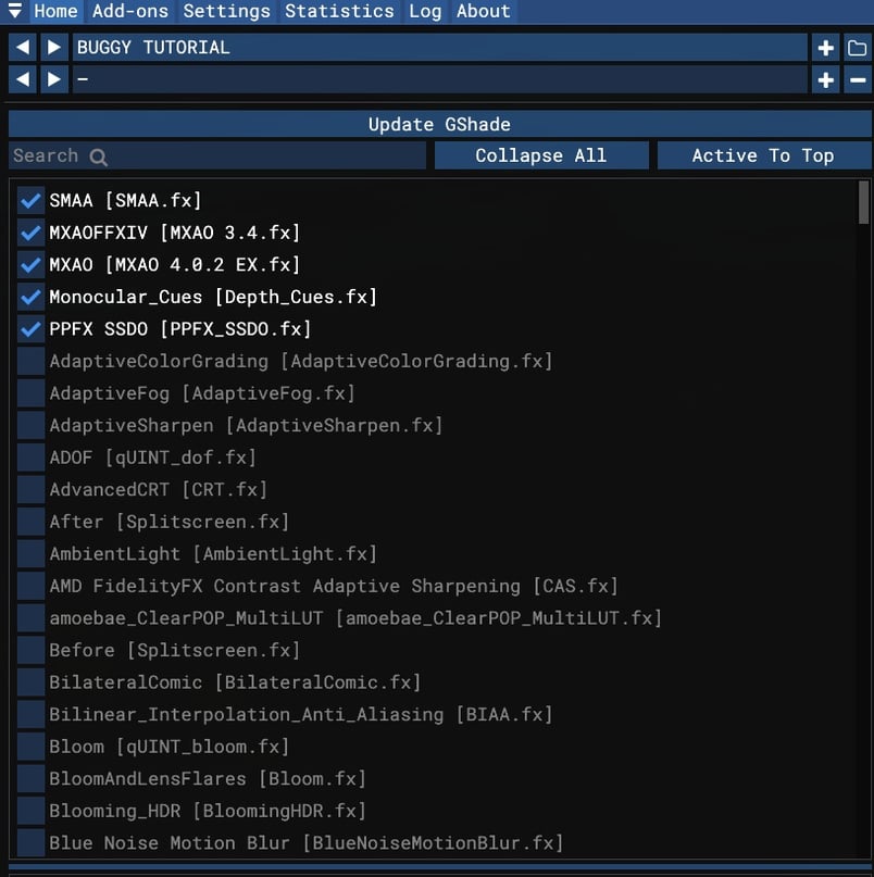
Again, I remind you that you can use the shadow shaders that appeal to you, with the saturation level that pleases your heart. You can use just one MXAO shader, all three, or mix MXAO, SSDO and Monocular Cues.
Let's move on to blurring.
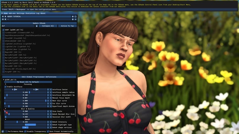
Blur creates a depth effect, helping to focus attention on characters and objects. These are all shaders with "DOF" (depth of field) in their name, which determines the distance from the nearest to the farthest object.
The most versatile and easy-to-use ones are ADOF and Cinematic DOF.
Let's start with ADOF.
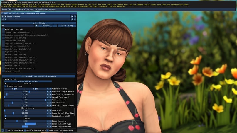
This is a great shader for simple focusing: the character remains sharp while the background is blurred. It's best used when you need to focus on an object closest to us.
Let's look at the settings. The first slider we need is "Far Blur Curve," which determines the focal distance and how far the blur will extend. The higher the value, the greater the distance.
Visual examples:
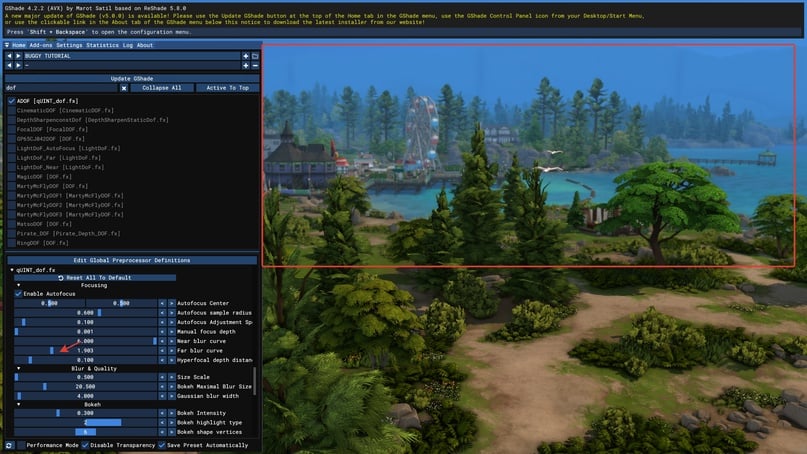
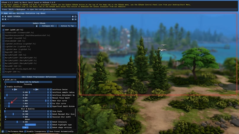
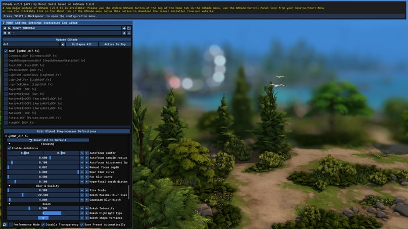
*1 of 3: with a higher value, most of the image is in focus, while the distant perspective is blurred*
Next comes a handful of settings for the actual "shape" of the blur.
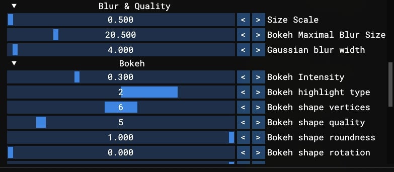
Bokeh – a soft, blurred focus effect. Gaussian blur – a low-frequency blur that smooths out all live pixels.
Examples:
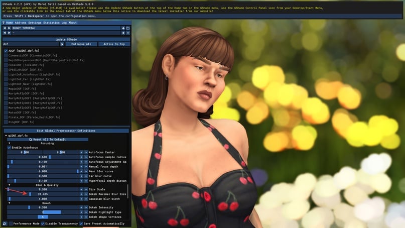

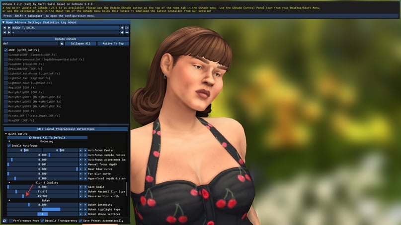
*1 of 4: bokeh effect reduced*
Also lower the bokeh intensity, don't hesitate to adjust the slider. I often customize different blurs for different presets – you can do the same or set it up once and reuse across presets.
Now let's look at Cinematic DOF. This is our second tool for focusing, and I like to use it when I need to compose a more complex shot.
For example, our sim is talking to another sim, and we don't really need the back of the latter in focus for this shot.
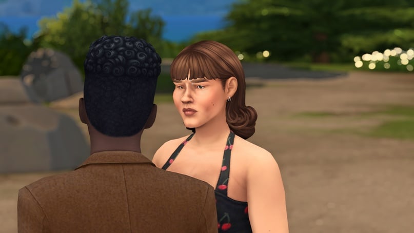
Let's enable cinematic depth of field (remember that the advice is advisory, and generally ADOF is sufficient in most cases). We're interested in the focal distance and aperture.
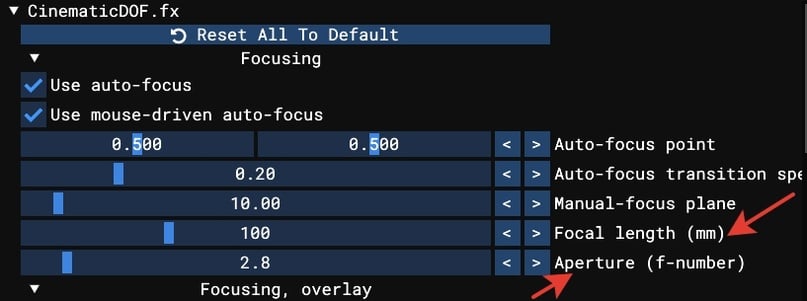
The focal distance works just like in ADOF and generally in the world of photography, while aperture is essentially the "width" of blur that depends on the amount of light. Let's adjust and achieve the following:

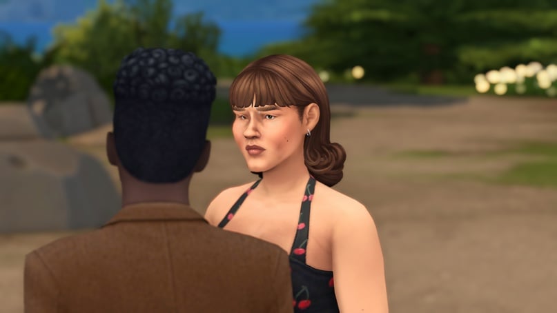
*1 of 2 with only adof, focusing on two characters standing close to the camera*
We've laid the groundwork! If you're still alive after this intense part, go grab another cup of tea.
*1 of 2 without any shaders at all*
Everything looks pretty good already at this stage; I often shoot gameplay with just these three shaders. But we’re not stopping here!
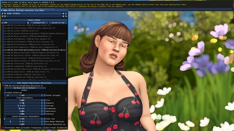
BRIGHTNESS, CONTRAST, EXPOSURE
Let’s move towards adjusting our image. This is where the greatest variability begins. What does your heart lean towards? A bright preset, like the light of God? Or a dark, muted tone?
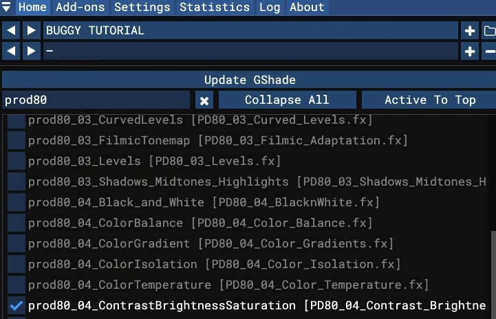
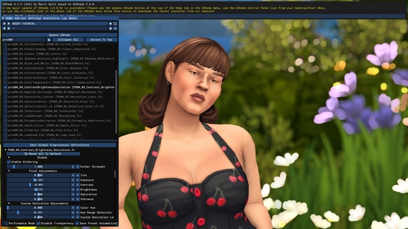
Before “coloring” the preset, let’s work on the basics. We’ll need shaders from prod80. Search for contrast – brightness – saturation.
Let's look at the settings. We have brightness, exposure and contrast. What's the difference between exposure and brightness?
Brightness determines how much light pixels emit in the image.
This is high brightness.
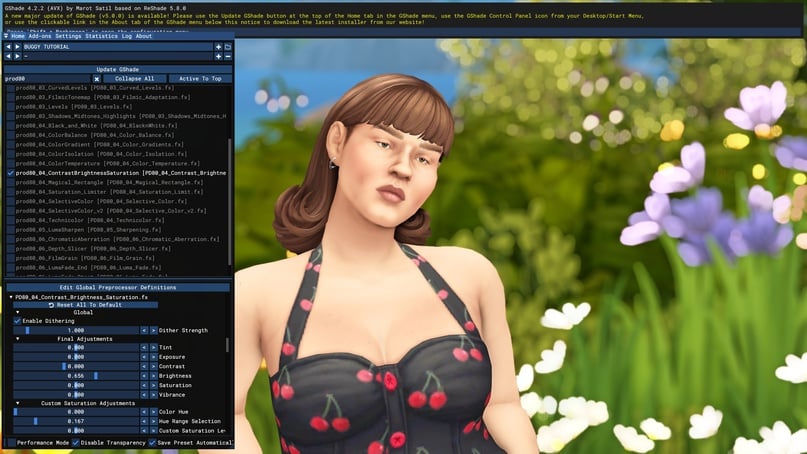
Exposure is the amount of light that hits the virtual sensor (or virtual matrix) in our case.
This is high exposure. You can notice that the brightness of the image extends from the brightest points in the shot.

A little lower, there are also parameters for saturation, but let's leave them for another time.
We adjust the sliders, but try not to cover up the entire need for changing the picture with them. This is the overall tone of the preset, not its "definition."
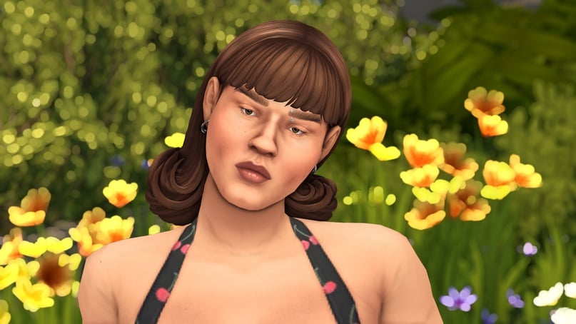
Examples:
*1 brighter and softer*
Don't forget to adjust all three sliders to balance the image.
Let's say our goal is a darker base. But if we only decrease exposure, it will be overexposed and unattractive. Adjust accordingly.
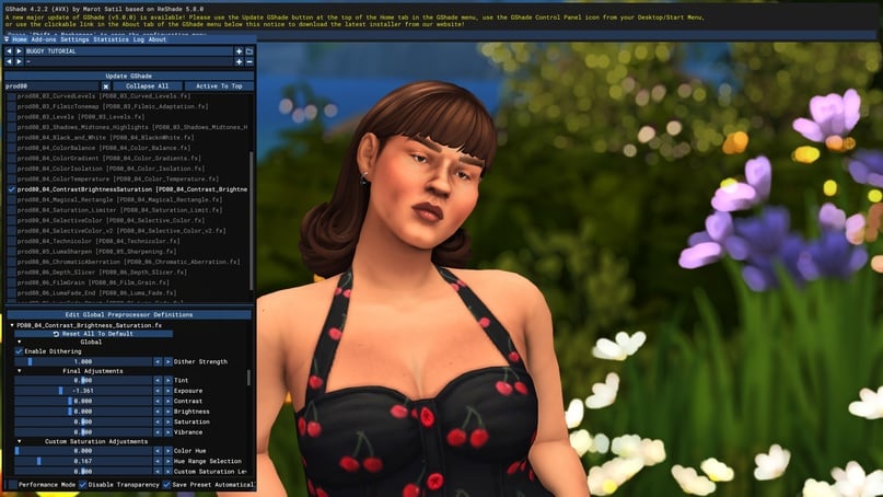
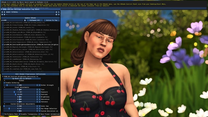
*1 of 2 very orange, we adjusted only exposure*
There's no universal advice on how to do it well. Only practice and experience.
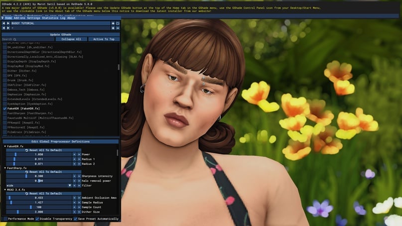
SHARPNESS
If you want more sharpness, you have the sharp shaders at your disposal.
You can increase sharpness in two ways – around the edges or across the entire canvas.
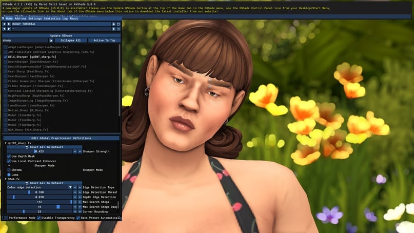
I prefer the "across the canvas" approach because tweaking already jagged edges in the game slightly bothers me, but again, it's a matter of personal taste. To overall sharpen the image, the DELC sharpen shader comes to our aid. Similar to it is NLM sharp.
Example of adjusted sharpness.
*1 of 2 screenshot*
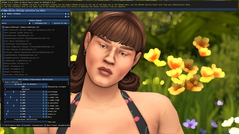
There's also the popular Adaptive Sharpen. This sharpens the edges.
Similar to it, there's Fast Sharp, which is also good.
Sharpness will look different on various monitors, so I recommend choosing a shader and adjusting its settings to your liking. Also, on smaller laptop screens, softened edges may not be as noticeable, and the effect will be good, so don't discount edge sharpening (like Adaptive Sharpen).
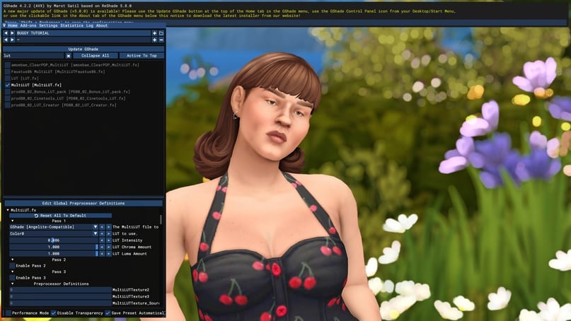
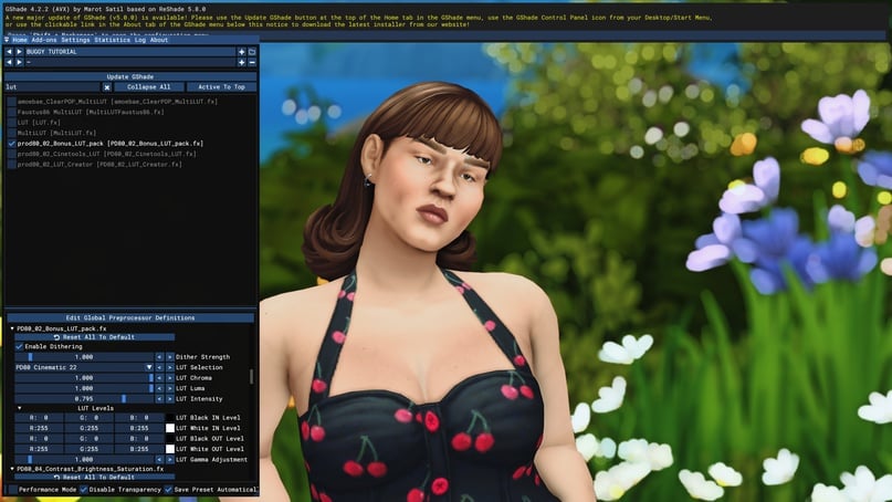
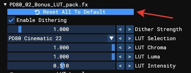
PRESET COLORING: LUT
This is the easiest way to color a preset in a specific gamut. Enter the word LUT in the search.
LUT is a pre-prepared filter, template.
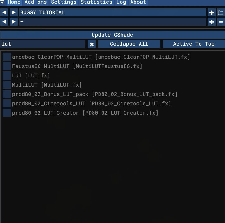
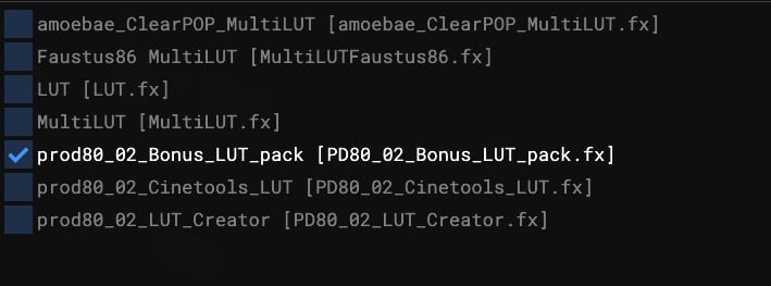
In GShade, there are several LUT shaders available from different authors. I particularly enjoy the Bonus LUT Pack.
There are flexible settings and a choice of 50 filters available.
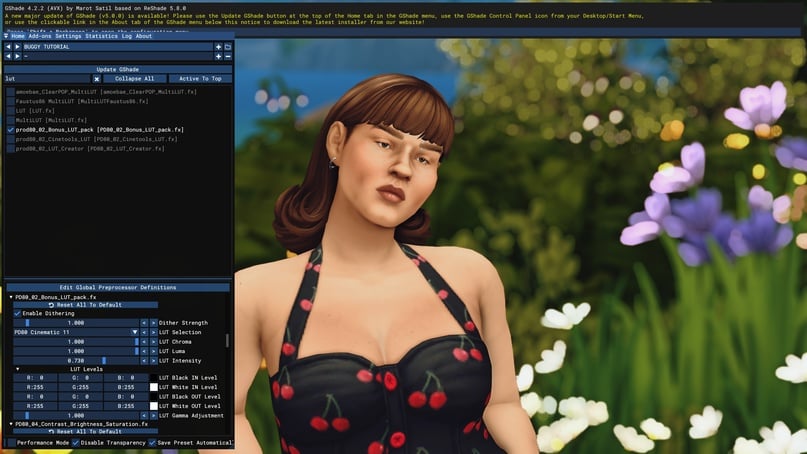
LUTs, it's challenging to write a comprehensive guide because there are millions of color adjustment options. I can only specifically mention the "LUT intensity" setting, which controls the strength of the filter.
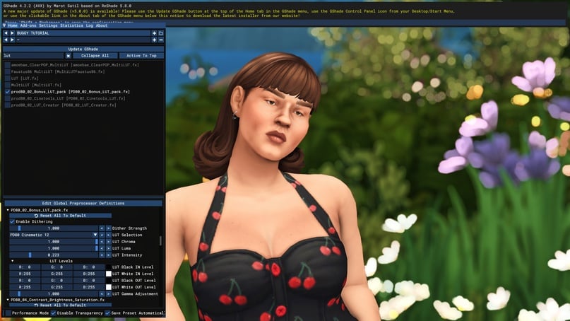
*1 of 3 light and delicate, with reduced green*
Overall, the heaps of information at this stage should be enough to create something for yourself: adjust shadows, blur, smoothing, increase or decrease overall brightness, apply a color filter on top.
For those intending to go all the way, here's the next part. I'll reiterate that the coloring process is improvisational. You may not use LUTs and instead use shaders from the list below or any I haven't mentioned. You can use them all at once. There are countless combinations and options, and this is just a basic overview.
POPULAR SHADERS
Apart from LUTs, there are other shaders for coloring and setting the mood. I'll provide examples of using some.
Adaptive Fog
Fog. Looks great on landscapes, creating a misty effect. The amount of fog is controlled by FogCurve, and the color can be changed by clicking on the desired color in the palette.
*1 of 2 fog*
DPX
A pleasant shader that forms the basis of many light presets. Standalone, it provides a cute, bright coloration of the image. Intensity can be adjusted.

FAKE HDR
A great tool for enhancing brightness. If adjusting the desired tone with exposure and other settings didn't work out, HDR can be very helpful.
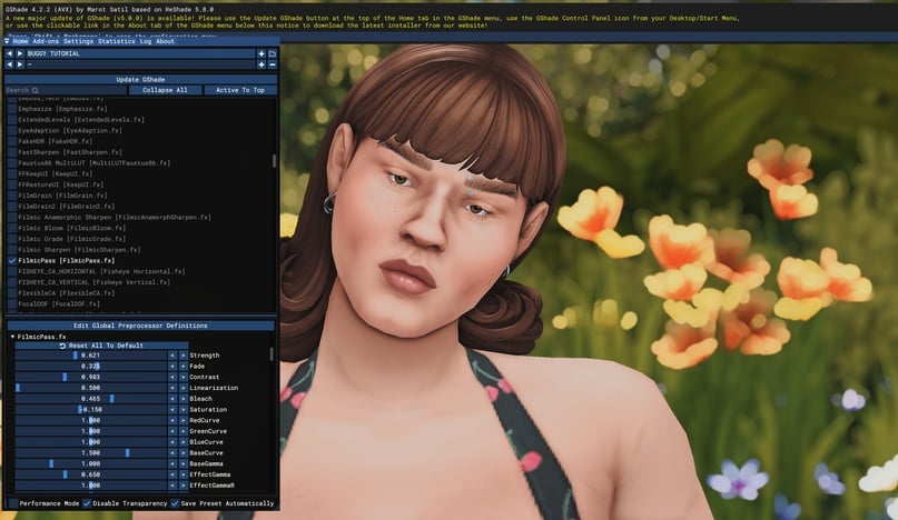
FilmicPass
An iconic shader with its characteristic pink tint, foundational to many presets, and quite flexible in customization. The first five parameters are well-tuned, adjusting the amount of pink, contrast and whitening.
Lightroom
If someone edits photos with Lightroom on their phone, they can achieve the same in GShade. This is a fully standalone shader where you can adjust everything from colors to brightness. However, adjusting the sliders requires some understanding (though trial and error learning is not prohibited).
LiftGammaGain
Very good color sliders, much more convenient than those in Lightroom. You can adjust color balance: for example, if you like a LUT but find it too yellowish, these sliders are here to help you.
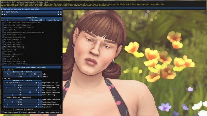
RetroTint
You can create a light haze similar to old photos. It provides a wide field for experimentation. The color and intensity of the haze can be adjusted.
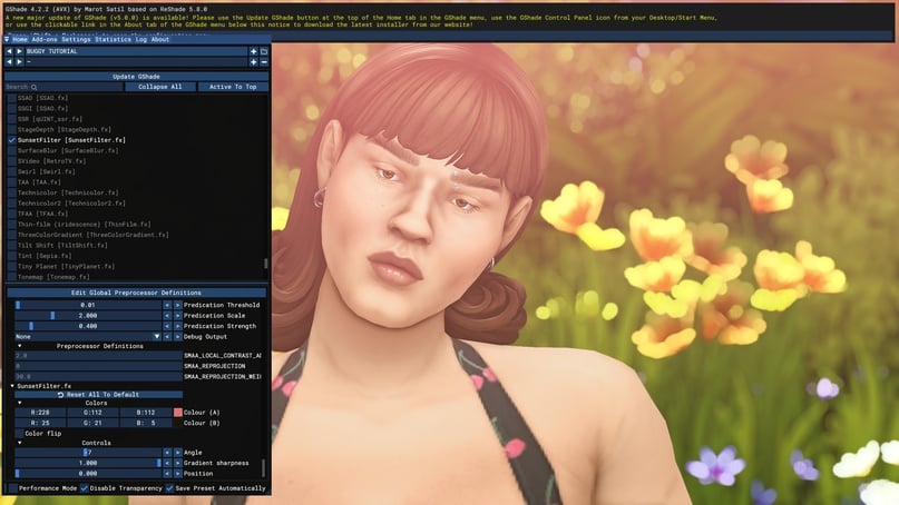
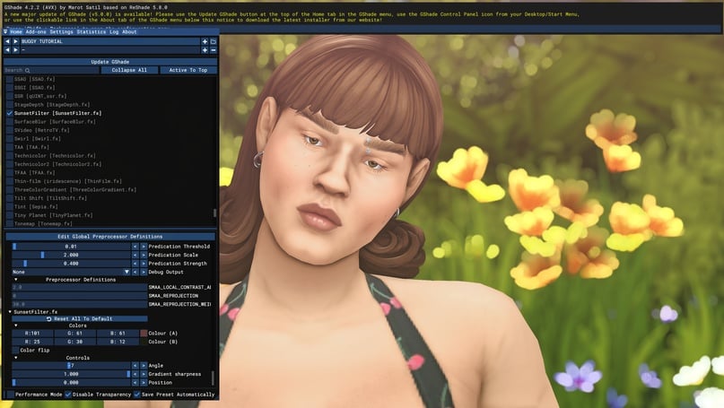
SunsetFilter
This shader is also versatile, allowing you to create either a vibrant gradient or soften the image. Colors and their positions can be adjusted accordingly.
Technicolor, 1 and 2
The first is cool-toned, while the second is vibrant. I use them as auxiliary shaders when I need to mute or restore color. Intensity can be adjusted accordingly.
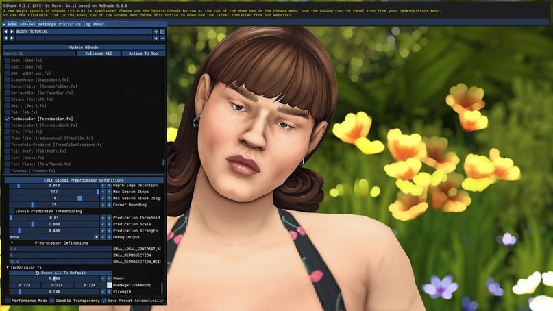

*1 of 2*
These are the mainstays of many presets. However, you can – and should – always go beyond the scope of this guide and try any shader from the list.
*for example*
EFFECTS
In addition to the aforementioned options, in Gshade you can also add various effects such as grain, glow, lens flares and particles.
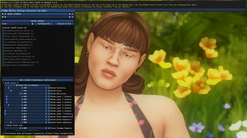
Glow and lens flares are implemented via bloom shaders.
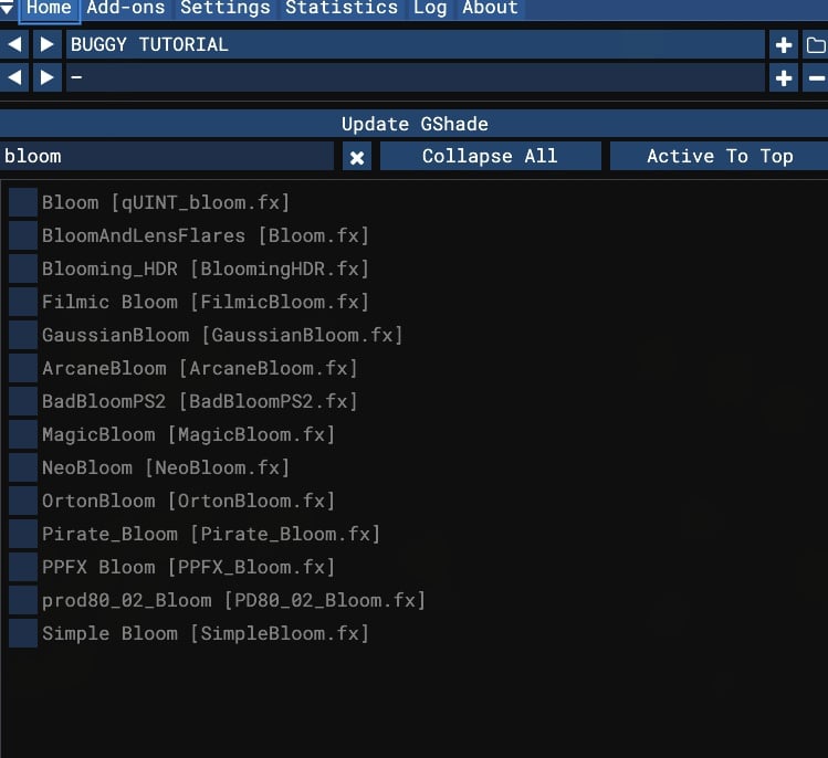
Each shader provides a different effect; my favorites from the list are quint_bloom and arcane. The first one is highly versatile, allowing you to achieve almost anything from emphasizing night lights to softening and highlighting the overall image. For those who enjoy vibrant presets, this is the number one helper. The first three settings should be sufficient: bloom intensity, curve (how the light spreads), and saturation.
*Example for 1 of 2*
Arcane is convenient to assign to a hotkey and can effectively highlight a character during nighttime (without the smoky effect of the shader above). It's very bright, so set a low value for intensity and exposure.
*1 of 2 without*
Well, and it looks great at night.
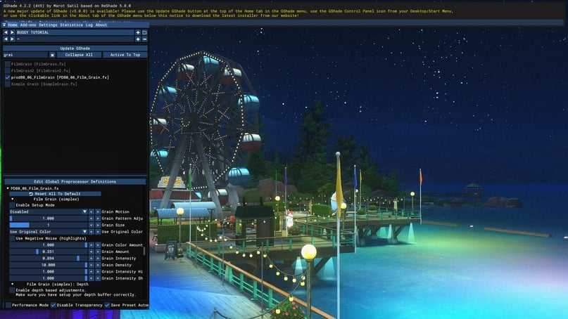
The shaders responsible for grain are under the grain category. You can choose virtually any of them. The intensity settings are usually controlled by parameters like "amount" and "intensity."
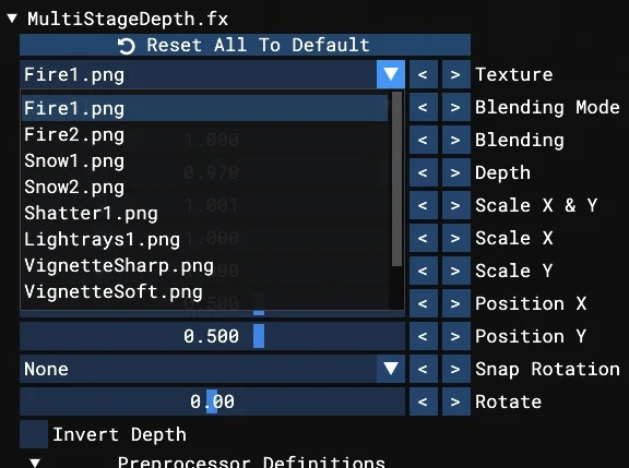
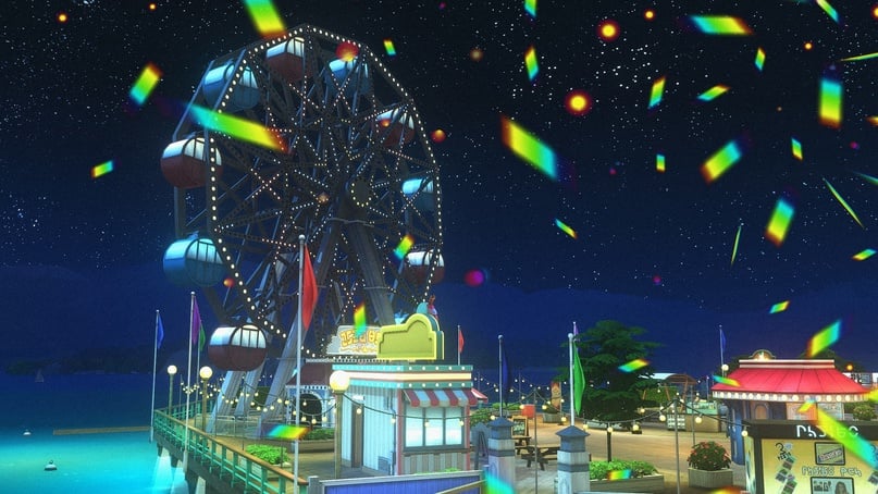
The shader MultiStageDepth is great for adding effects and particles. Choose the effect you like from the list and adjust the settings boldly, because here the more chaotic, the better.
OPTIMIZATION
After applying the initial settings to your image, it's important to set up hotkeys for quick access. I recommend assigning hotkeys right away for shaders like shadows and blur, which are typically used only for screenshots.
Right-click on the desired shader, assign a hotkey. You can use key combinations or any random key. I always use [, ], \, /, ', ; because they are conveniently located on the keyboard :)
Once you've set up the hotkey, simply click on an empty space to save it.
What should you do if you've applied too many shaders and the interface has become unusable?
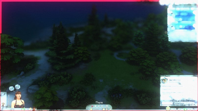
We need two shaders – keep UI and restore UI.
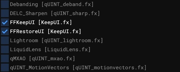
They need to be placed correctly. Keep UI goes to the top, and restore UI goes below it, but blur shaders should come after it – otherwise, they will not work correctly.
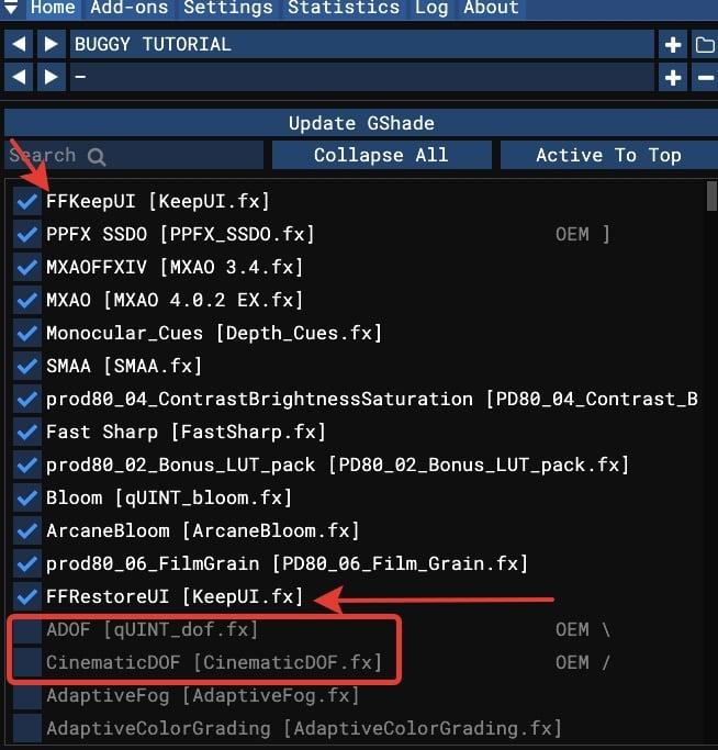
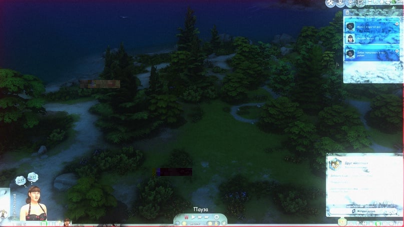
This will help the interface to come back to normal – it will still have a slight glow from the bloom shaders, so the best solution would be to assign them to a hotkey and enable them for screenshots. However, the interface will still become much more usable.
*1 is before*
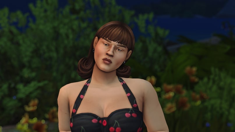
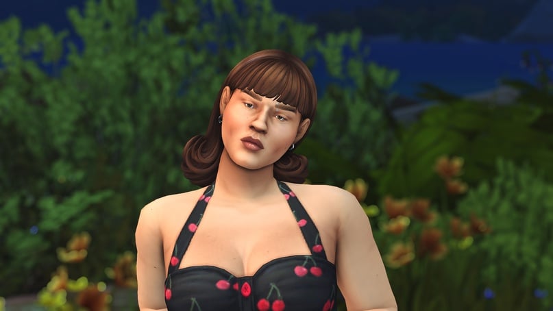
Next comes testing. See how the preset behaves indoors, early in the morning, and in the evening. If it turns out to be very dark indoors, balance the image using brightness, exposure, HDR, and tone mapping shaders.
With experience comes an understanding of colors and optimal base brightness. What I put together during the tutorial looks adequate at different times of the day.
*1 is 10:00*
And at home, in both bright and subdued light.
The more components a preset has, the harder it is to make it universally applicable. The more you shift towards warm or cool tones, the greater the risk of imbalance.
TIPS
Random set of useful tips:
- If you've been tinkering with a shader for a while and realized you've messed everything up, you can revert to its default state. Just click on "reset to default".
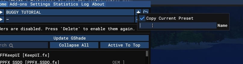
- Make more copies. Like the intermediate result? Save it. Click on the plus sign in the top corner and check "copy current preset". Name the new one something like v.2 and keep working – if you mess something up, you always have a base to return to.
- Don't be afraid to add situational filters. You've created a cool preset that you really like, but at certain times of the day/year, it feels too cold? Add a shader that compensates for this and assign it to a hotkey – it could be a subtle yellowish haze, adjusted curves. Use it when the image drifts from what you desire.
- Analyze other presets. For personal use, you can tweak them in any way you like (but if you plan to share them, ask for permission from the original author). Turn shaders on and off, review settings, use the advice above, and try to balance things out through copies.
- Explore all shaders in the shader pack – nothing in the game will be affected; you can always disable what you don't understand. However, some shaders might lead you to interesting discoveries.
I hope this guide helps you understand how things work together and provides you – and the community – with more room for creativity.
buggy starship:
